UX CASE STUDY · CIVIC DESIGN · Designed and built in one day, 2026
A courthouse kiosk that turns ten minutes of plain questions into paper in hand at the clerk's counter.
Answer plain questions at a court self-help kiosk. The navigator screens your fee waiver eligibility against real poverty guidelines, names your claim in both your words and the court's, and prints a three-page packet: cover sheet, waiver information, document checklist. One HTML file, nothing leaves the device.
Solo end to end in a single day: design ritual, three views, verification rig, decision records. The build doubled as the proving run for a new standard: no AXOS build starts coding before the taste loop ratifies its visual world.
The Problem vs. The Solution
Most low-income Americans facing a civil legal problem get no legal help at all. The bottleneck starts at the self-help desk: a stressed visitor, a stack of unfamiliar forms, and a staffer repeating the same twenty minutes of triage all day. The navigator moves that triage onto a kiosk and ends every session with something physical: a packet the visitor hands to the clerk.
The triage desk does not scale
Court self-help centers answer the same three questions all day: do I qualify for a fee waiver, what is my case called, and what do I need to bring. Each answer is verbal, repeated, and forgotten by the parking lot.
Ten minutes, three views, one packet
A single-file kiosk app in three connected views. Intake screens eligibility with a benefits shortcut and real poverty-guideline math. Classification turns plain answers into the court's claim name and a deadline warning where hours matter. The packet prints it all as paper the clerk can act on.
The Impact
A one-day build, so the numbers are structural facts about what shipped, verifiable by reading the repo, not projections.
The wide net, measured
Key Design Decisions
Three calls that shaped what the navigator is, and the process it proved.
Nine full pages were designed, screenshotted, and judged across three gated rounds before the first line of app code. The winning world, frosted atmosphere with an anchored glass card, became law for all three views.
One-shot design is exactly how AI-default slop ships. Casting wide and gating on human taste costs an afternoon and buys a product that does not look like everyone else's. The repo history is the design lineage: round 1, round 2, round 3, then the build.
Answers never touch localStorage, cookies, or the network. State is a JavaScript object; Start Over reassigns it. The privacy promise on the landing page is enforced by architecture, not policy.
The audience is people describing evictions, debts, and firings on a public kiosk. "Your answers stay on this device" has to be literally true, and provable by reading one file.
The screening math names its exact sources, 125% and 200% of the 2025 federal poverty guidelines, and prints them on the packet. Deadline warnings deliberately stay generic: short, often days, ask the clerk today.
Poverty guidelines are published federal numbers; citing them builds trust. Answer deadlines vary by jurisdiction, and a confidently wrong number on a legal kiosk is worse than an honest pointer to the person who knows.
Round one vs. the shipped world
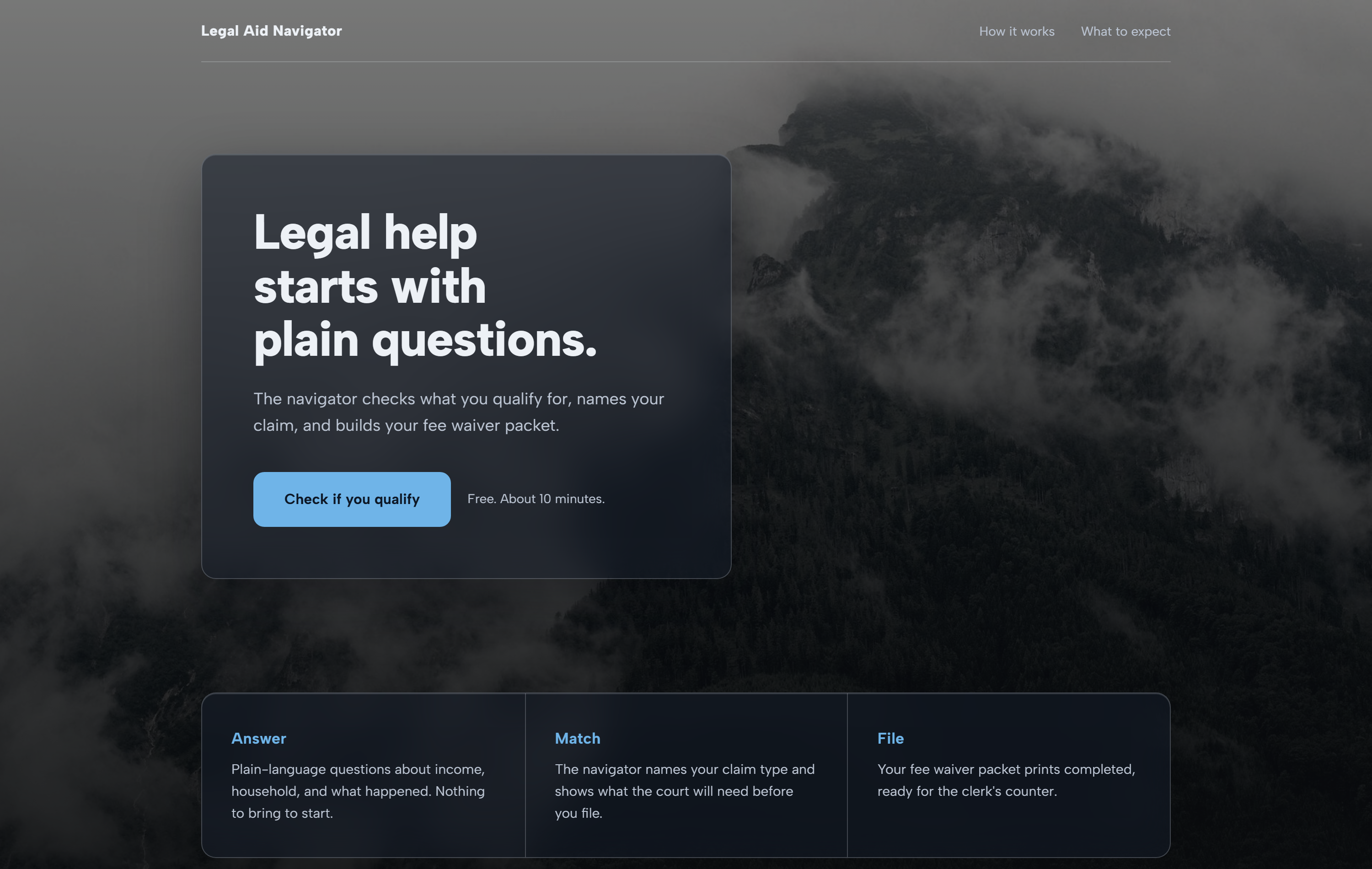
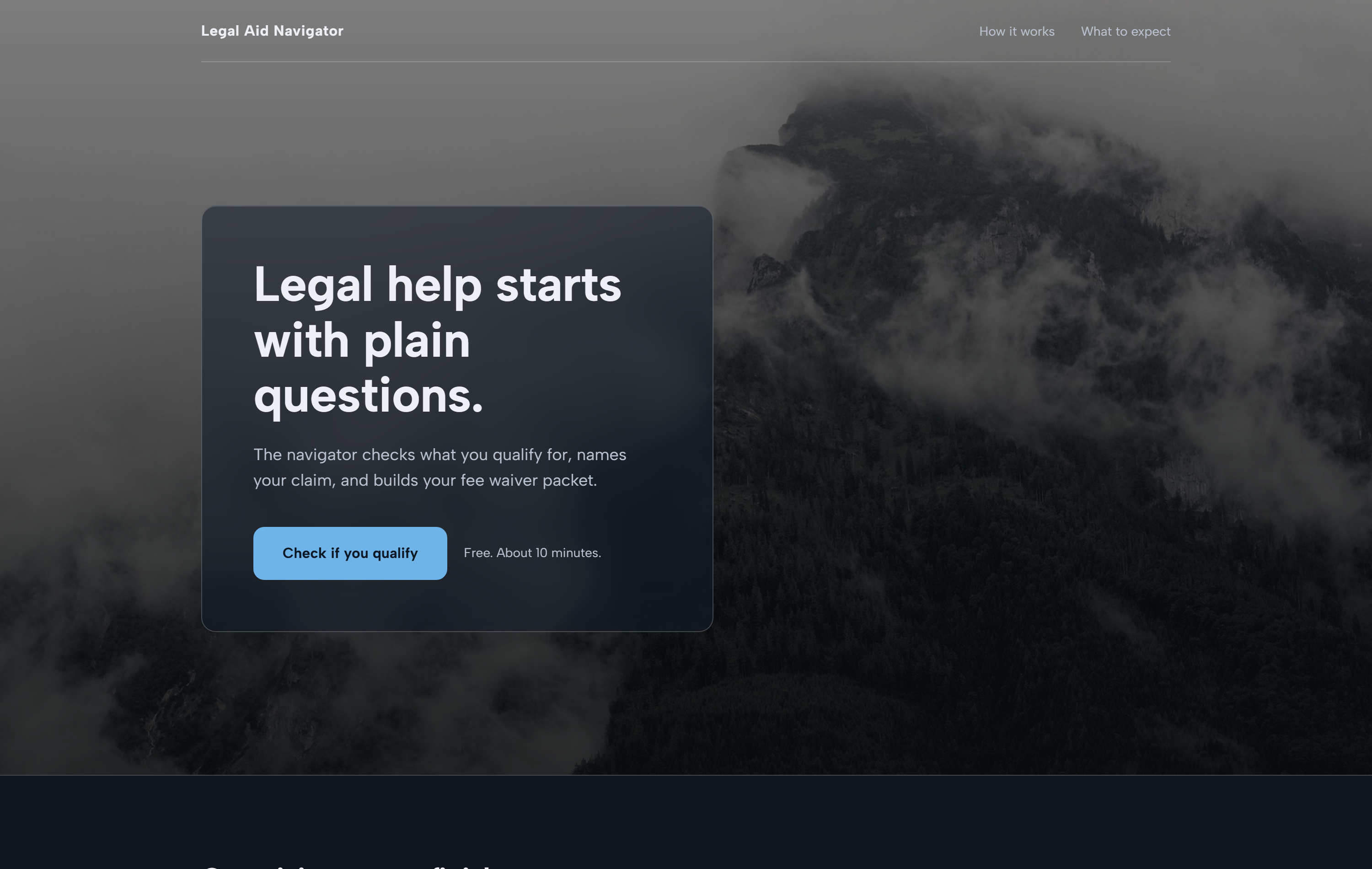
The frosted direction as it entered the taste loop, and the same layout after the polish gate: weighted entrances, tightened type, a deeper grade, and the detector-enforced removal of every AI tell. Drag the handle to compare.
Walk the kiosk yourself
The real build, not a mockup: screen your eligibility, classify a claim, and print the packet. Try the benefits shortcut, then Start Over and take the income path. Everything runs in your browser and nothing you enter goes anywhere.
Through the Kiosk
Live screens from the shipped build, plus the wide net it was chosen from. Every image opens full size.
Design Process
The design was chosen before the product existed. A five-family wide net, two human gates, then a polish pass, and only then did app code begin inside the ratified world. Every round is one commit, so the repo history reads as the design lineage.
- ▸Five full landing pages, five aesthetic families
- ▸Same product truth in all five: only taste varies
- ▸One deliberately unfashionable wildcard, per the loop's rule
- ▸Frosted Atmosphere won the first gate
- ▸Three layouts inside the family, aesthetic held constant
- ▸The anchored glass card won the second gate
- ▸Weighted entrances, scroll reveals, typographic detail
- ▸The anti-slop detector flagged its own author's glow shadow
- ▸Reduced-motion and reduced-transparency fallbacks throughout
- ▸Three views built inside the ratified world, same day
- ▸Playwright walks every path before every commit
- ▸Print verified with a real PDF export, not a description
The detector caught its own author, twice
The anti-slop pipeline this build proved is only honest if it fires on me. It did. A glacial-blue glow shadow on a hover state in round 3, and a layout-property animation on the intake's progress bar: both mine, both minutes old, both flagged mechanically and fixed before commit. That is the actual lesson of the taste loop. Taste is not a vibe you have; it is a gate you build, and then you stand in front of it with everyone else.
Let's build something impactful.
I'm currently open to new opportunities in UX/UI Design, Product Design, and GovTech transformation roles.