UX CASE STUDY · LEGAL TECH · May to July 2026
People sign contracts they don't understand. This one reads it back, with the law attached.
ClauseGuard checks rental and employment contracts against BC and Ontario law. Every flagged clause carries the statute, what it could cost you in dollars, and one sentence you can send to push back. A UX case study that became a working product.
Solo build. A dated decision log from day one, 18 ADR-style entries, one six-pillar audit, one aesthetic pass. Built for renters and new hires under time pressure, looking at a document the other side wrote.
The Problem vs. The Solution
Most people in Canada sign rental and employment contracts without knowing which clauses hold up. The other side wrote it, you have a day to sign it, and no way to tell which parts would survive a dispute.
Signing blind
The document becomes the interface
The Impact
A design-led MVP, so the numbers are about integrity. The public demo runs on four example contracts, and every screen says educational tool, not legal advice.
From a Document to a Decision
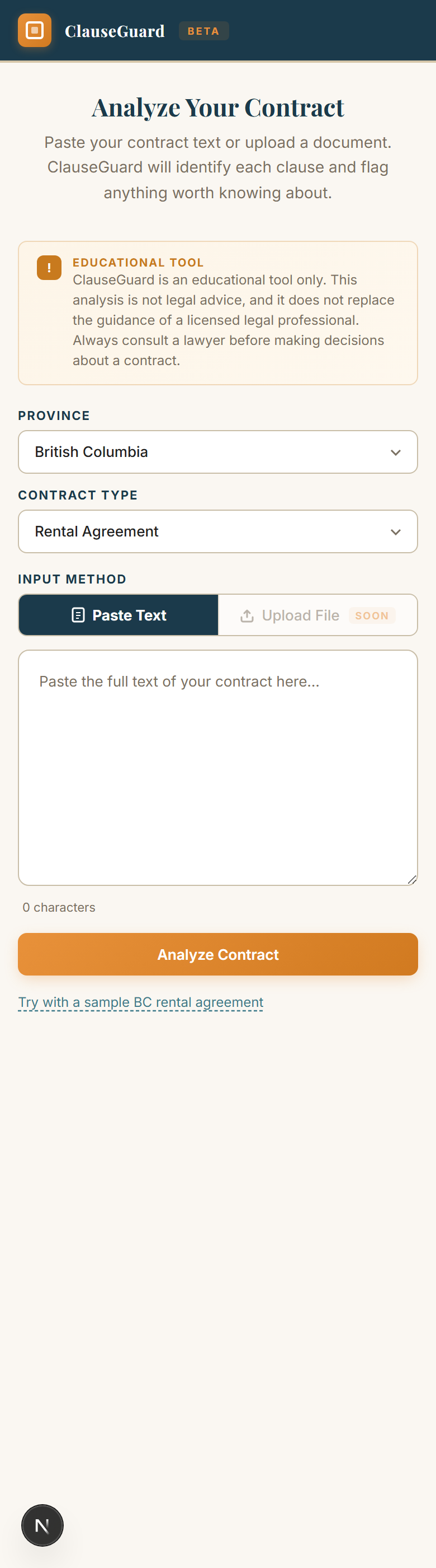
Two dropdowns in, one answer out, then the detail on the document itself. The reader leaves with one of three moves: sign, send the push-back line, or file with the deadline in hand.
Key Design Decisions
Five calls from the 18-file log shaped the product most. Each is dated, with the rejected options written down.
Two sample datasets shipped first; ask for BC employment and you silently got the wrong one. The fix was authoring the two missing datasets, not a banner explaining the swap.
A disclosure next to a lie is still a lie, just a labelled one.
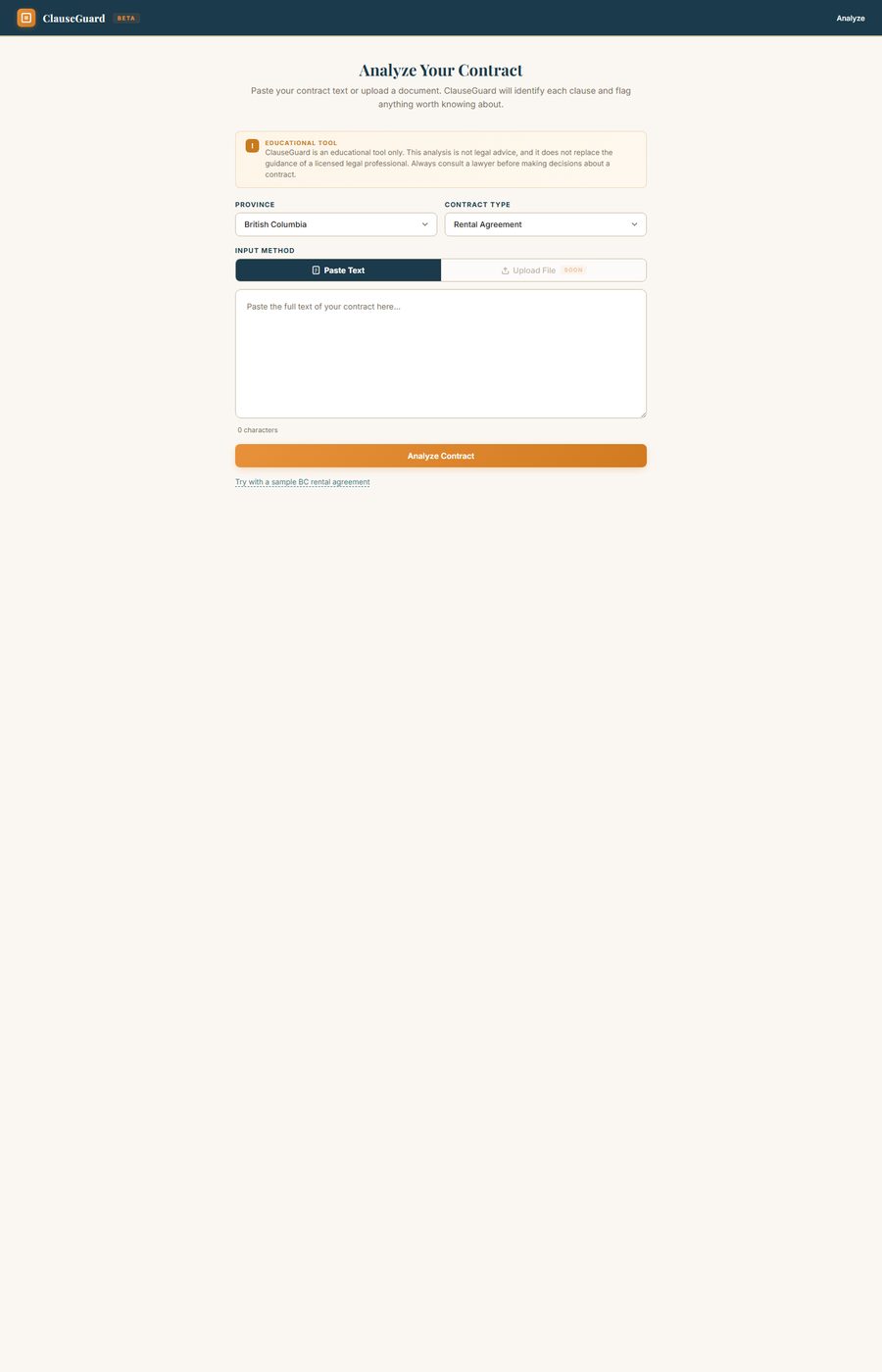
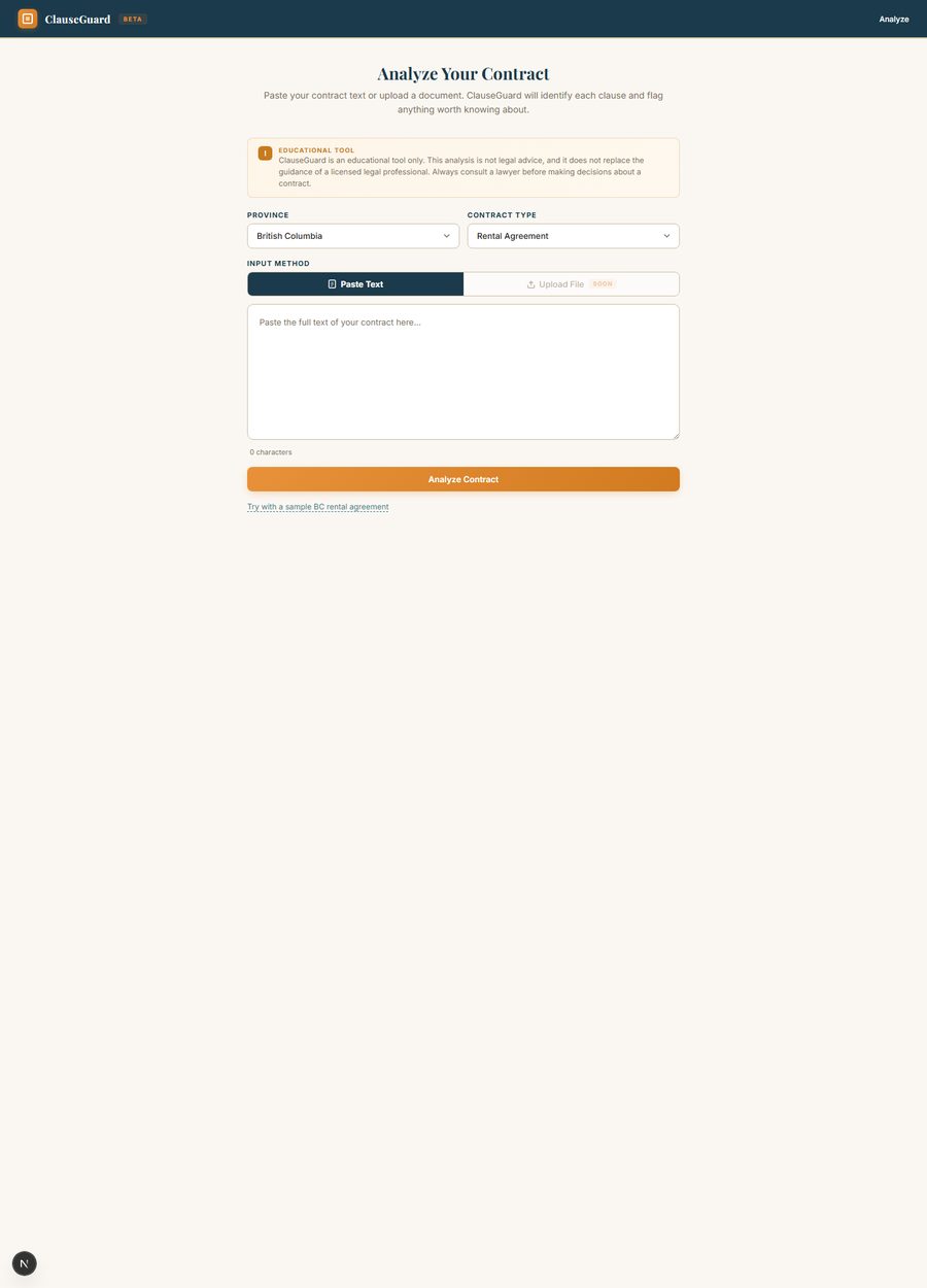
The paste box never drove anything; the dropdowns did. It is read-only now and previews the exact sample your selection loads. The one working action is the biggest thing on the page.
Selection is the input, so the UI says so.
The results screen used to discard the contract after analyzing it. Now the Analysis tab is a split pane: contract left, tinted by severity, findings right, a rail between them, and detail opening in place.
The document is the thing people are anxious about. The analysis only makes sense on it.
What’s at Stake names the consequence per clause, in dollars only where the contract itself supplies the figure. If You Want to Push Back is one copyable sentence citing the section.
A sentence you could send beats a paragraph of advice.
Every flagged clause locates itself verbatim in the document pane; all 46 anchor, checked before build. A clause that failed would render unhighlighted, never mis-pointed.
The severity rail only earns trust if it never points at the wrong paragraph.
Audited, Then Dressed
A six-pillar UI audit ran against the working build with a Playwright walker, then one craft pass re-skinned the layout without moving it.
Fixed at the root, not bannered over
All four combos, five tabs each, mobile, clause detail, every external link. Zero console errors. What it found got fixed and logged.
The core action was a div with an onClick. Keyboard and screen-reader users could not open any clause. Now real buttons.
The data-integrity blocker that started the honesty thread. Resolved by authoring all four datasets.
The 404s were replaced; the remaining 403s were re-probed in real Chromium and confirmed as anti-bot blocks.
One pass, no layout changes
Newsreader, an optical-size serif, for headings and the contract text. Public Sans for UI. Mono only on spec labels.
Focus rings stay loud and the navbar carries an A- A A+ text-size control, for the person reading a contract at 11pm.
One missing viewport meta tag
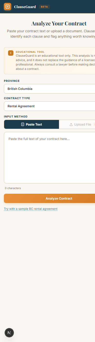
The whole mobile @media block was dead until decision 007 added the viewport meta. Drag to compare 390px before and after.
Inner Workings
What is on the page, how two dropdowns become a report, how a finding stays glued to its clause, and the states the app and each clause move through.
Try it
The production build, embedded. Pick a province and contract type, run the example, hover the findings and watch the document answer back.
Inside the App
Real captures from production and the research log. Every image opens full size.
What shipped after the first cut
A review of the overnight prototype lane showed every deadline-pressure tool ending with an export, because that is what the person came for. ClauseGuard ended with a closed tab. Four additions in a day: a report to carry out, an honest fingerprint on it, a reader’s own marks per finding, and the statutes named before the reader commits.
Confidence now reads as a glyph, a label and one sentence. The repo gained its first test runner on the way: 45 tests. The line from decision 002 holds; every new word is the reader’s note or a statement of what is checked, never a determination.
Design Process
The decision log is the process. Moodboard first, then the build, then an audit that found the blockers, then one aesthetic pass that dressed the layout it had earned.

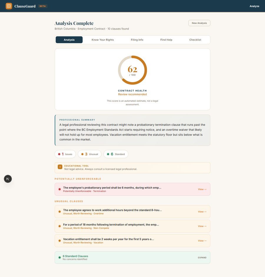
01 Discover. Blind signing framed as the problem; scope cut to BC and Ontario, rental and employment; educational, never legal advice.
02 Define. Traffic-light tiers, amber for warnings, red only for unenforceable; every red flag cites the Act.
03 Design. Gauge and summary lead; the document map; stakes and push-back lines.
04 Verify. Six-pillar audit, blockers fixed at the root, four combos re-verified.
The demo stopped pretending, and the product got more convincing
The most useful review note came from watching the demo lie. The paste box implied it read your contract. It never did. Fixing that meant deleting an affordance people liked, then authoring two whole datasets so no selection could return the wrong answer. None of that shows on a feature list. All of it shows in how the product feels.
Let's build something impactful.
I'm currently open to new opportunities in UX/UI Design, Product Design, and GovTech transformation roles.